Empathy Map
Pain Points
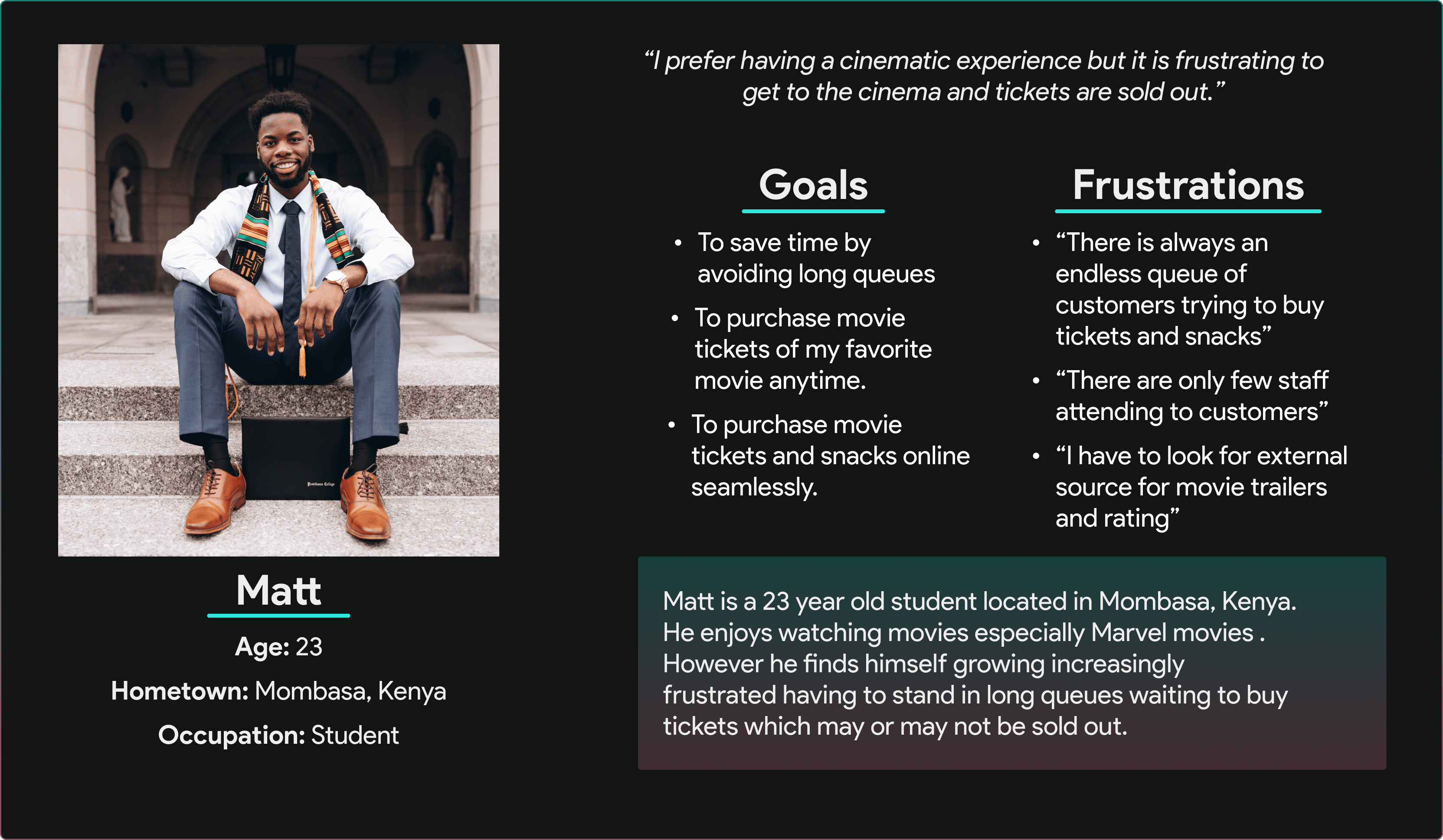
User Persona
User Journey
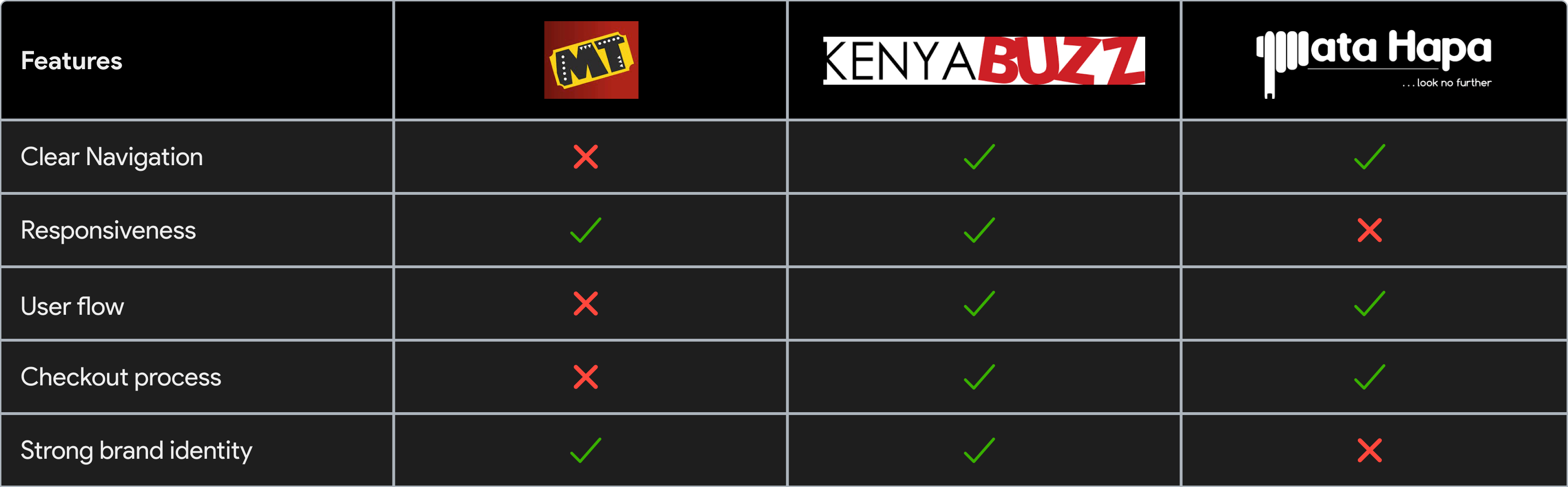
Competitor Analysis
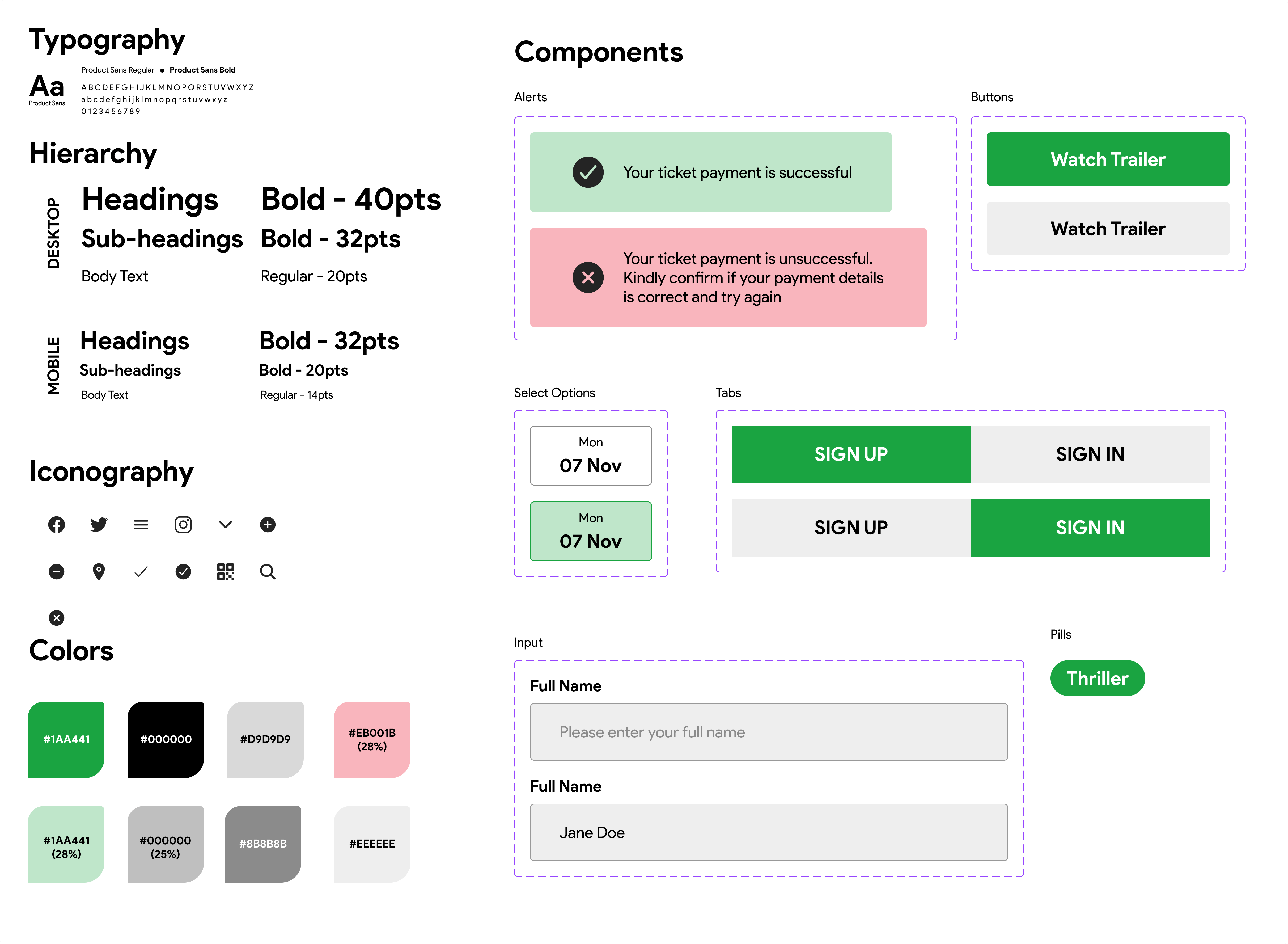
LoFi & HiFi Mockups
Final Prototype

“I wish buying movie tickets was easy to avoid in long queues”
Smiles and relaxes as he spoke passionately about his love for watching movies
Goes to the movie cinema physically to buy a movie ticket to watch a movie
Matt is frustrated having to wait in a long line to buy tickets in person.
Customers complain of getting to the movie theatre and having to wait on a long queue before they can get their tickets
Customers would prefer if there was a way to know the number of tickets left instead of not getting a ticket after standing in line.
Customers would prefer to get a brief description or trailer before purchasing a ticket in the cinema without visiting an external site.
Customers are frustrated with the existing ticketing systems since they are faulty and have long purchasing process