Overview
Building the driver experience from the ground up
Roundi is a last-mile delivery management platform built for Kenyan SMEs: restaurants, e-commerce stores, and retail businesses
that handle their own deliveries but lack the tools to do it efficiently. Think route optimization, live rider tracking,
and real-time ETAs, all in one place.
I was brought in to design the driver-facing mobile app, the tool that riders use on the ground every day.
This was a 0→1 product build: no existing designs to reference, no legacy patterns to follow.
Everything from the onboarding flow to the delivery confirmation screen was designed from scratch.
How do you design a delivery app for Nairobi riders; who are on the move, on low-end Android devices, in high-traffic conditions that actually makes their day easier?
The Context
The reality of last-mile delivery in Nairobi
Designing for Nairobi riders meant designing for very real constraints,not just user preferences. These weren't hypothetical edge cases; they were the daily reality for every rider the app needed to serve.
Low-end Android devices
Most riders use budget smartphones. The app had to be lightweight, fast, and functional on limited hardware.
Variable connectivity
Nairobi's network coverage drops in certain zones. Offline-tolerant states and graceful degradation were non-negotiable.
Eyes-off usage
Riders glance at their phones mid-route. Large tap targets, minimal reading, and audio cues were essential design principles.
Users
Two users. One product. Very different needs.
While I was designing the driver app specifically, the product sits inside a larger ecosystem with two distinct users and understanding both helped me design the driver experience to complement what businesses needed on their end.
The Rider
Primary user of the driver app
- Know exactly where to go and in what order
- Confirm deliveries quickly without friction
- See earnings clearly and in real time
- Get support when something goes wrong
The SME
Business admin dashboard user
- Track all riders and deliveries in real time
- Reduce failed and late deliveries
- Hold riders accountable without micromanaging
- Keep customers updated automatically
Design Process
From zero to a full driver experience
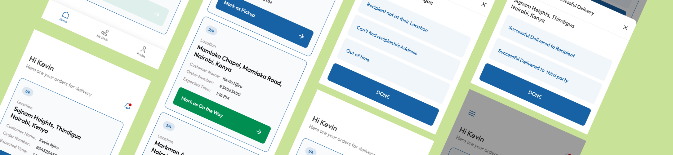
With no existing product to build from, I started by mapping the complete rider journey, every touchpoint from logging in for the first time through to completing their last delivery of the day.
01
Onboarding
Sign up, ID verification, profile setup
02
Go Online
Toggle availability, location active
03
Accept Job
View details, accept or decline
04
Navigate
Route guidance, stop order
05
Confirm
Photo proof, signature, OTP
05
Earnings
Daily summary, payout history
Design Considerations
Designing for the Nairobi constraint stack
Low bandwidth states: Every screen was designed with a loading and offline state, so riders aren't left staring at a blank screen when data drops. Core delivery info is cached locally.
Low-end device performance: No heavy animations, no complex UI layers. The design system prioritised flat, performant components that render fast on budget hardware.
Minimal reading required: Icons, colour, and spatial hierarchy do the heavy lifting. A rider shouldn't need to read a sentence to understand what to do next.
One-handed use: All primary interactions sit in the bottom third of the screen, reachable with a thumb while the other hand holds the handlebar.
Reflections
What building for the field taught me
Context is the brief: A rider on a bodaboda in Nairobi traffic is not the same as a user sitting at a desk. Designing for their real context, not an idealized one, produced better decisions at every step.
0→1 demands first principles: With no existing product to reference, every decision had to be justified from the ground up. It sharpened my ability to reason about UX choices rather than just follow convention.
Failure flows are product design: How an app handles things going wrong defines the product just as much as the happy path. I spent as much time on error states and failed deliveries as on the core flow.
Dignity in design: Riders are professionals doing skilled work in tough conditions. The app needed to feel like a tool that respects them, not something that surveils or pressures them.