Overview
One of Kenya's oldest travel agencies. A website that didn't match its reputation.
Magical Holidays (K) Ltd is one of Africa's leading travel and safari management companies
based in Nairobi, operating 24/7, and specialising in fully customised holiday packages across
beach, safari, and international destinations. With years of industry expertise and a loyal client base,
the brand's reputation was well-earned.
But the digital experience hadn't kept up. I was brought in to lead a full end-to-end UX overhaul
of the web platform, rethinking everything from how users discover packages to how they
enquire and book, with the goal of making the site feel as premium and trustworthy as the service
itself.
How do you translate 24/7 personalised travel expertise into a digital experience that feels warm, curated, and effortless to navigate?
The Challenge
Great service. Painful discovery.
The core tension: Magical Holidays' value proposition is personalisation and expert curation but the website made users do all the work. Packages were hard to find, the booking flow had too many steps, and nothing on screen communicated the warmth and expertise that clients experienced in person.
Discovery was overwhelming
Too many packages with no clear filtering or categorisation. Users couldn't quickly find holidays that matched their budget, destination, or travel style.
Booking flow had too much friction
The enquiry process required too many steps with no clear progress indication causing users to drop off before completing their request.
The UI felt cold and generic
Standard travel website patterns: no visual warmth, no personality, nothing that communicated Magical Holidays' local expertise and personal touch.
Poor mobile experience
Most Kenyan users browse on mobile, but the site wasn't optimised for smaller screens, images cropped badly and forms were hard to complete on touch devices.
Design Process
Rethinking the end-to-end journey
I mapped the full user journey from landing on the homepage to completing a holiday enquiry identifying every point where users dropped off or got confused, then redesigning those moments first.
01
Land
Homepage impression
02
Discover
Browse & filter packages
03
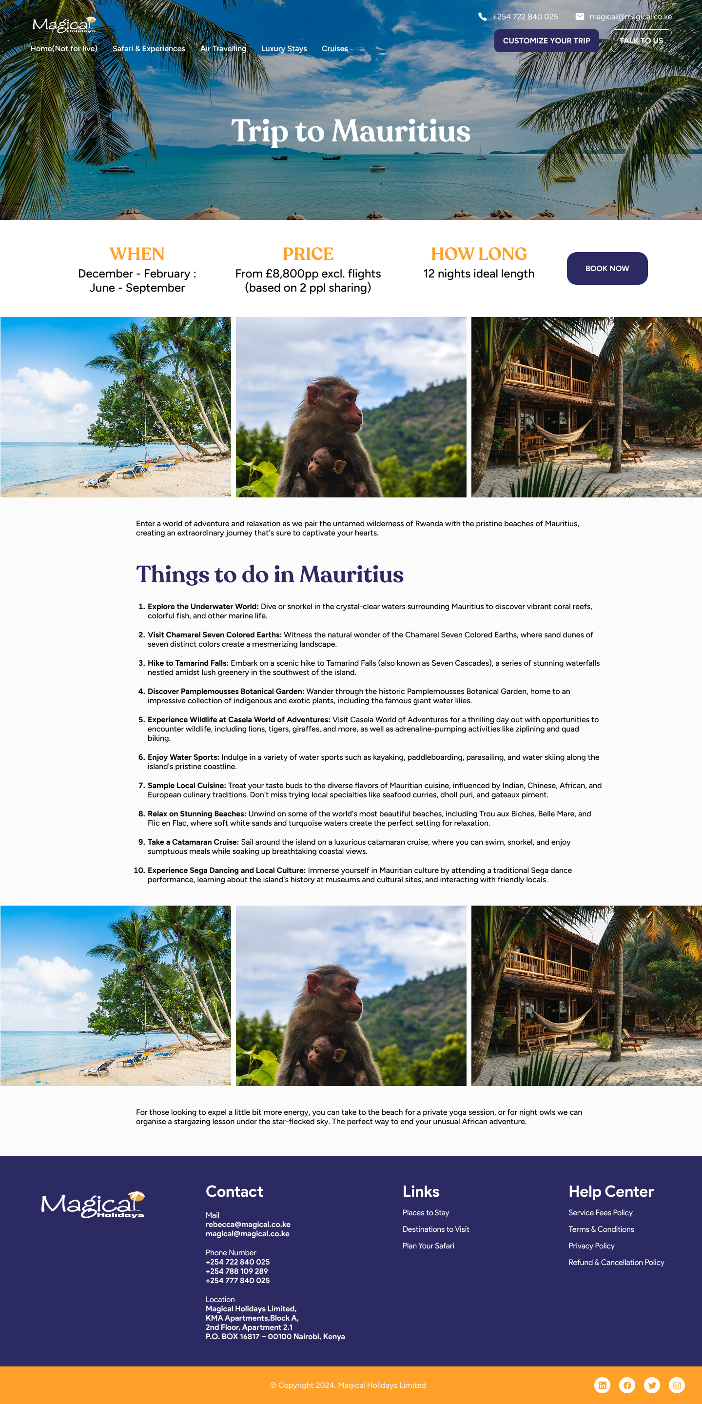
Explore
Package detail page
04
Enquire
Booking request flow
05
Confirm
Follow-up & confirmation
Key Design Considerations
Making the experience match the service
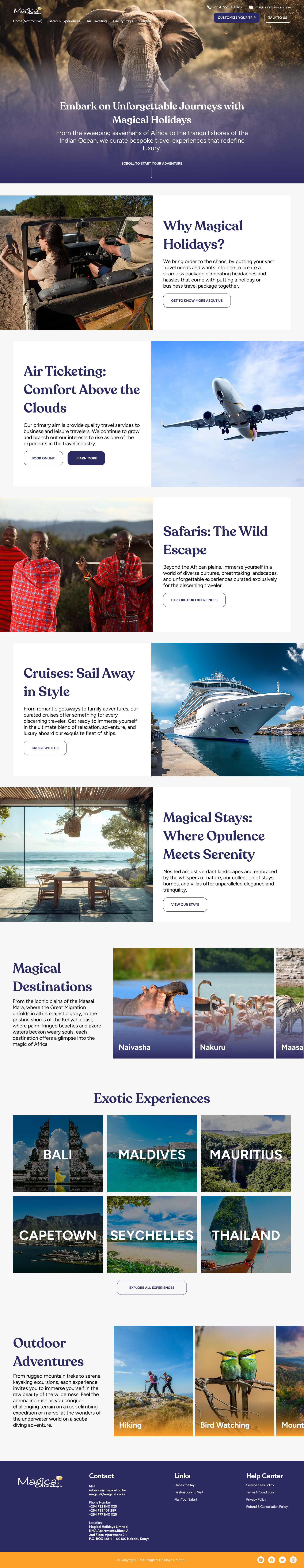
Homepage — lead with destination, not information
- Replaced the text-heavy hero with a full-bleed destination imagery hero and a single search prompt — destination, travel dates, number of travellers. Gets users into discovery mode immediately.
- Added a "Popular destinations" row below the fold — visual, scannable, and tappable — so users who aren't sure what they want can browse by place rather than by package name.
Package discovery — filter first, browse second
- Built a persistent filter sidebar — destination type (beach, safari, city, international), budget range, duration, and group size. Reduces the discovery burden from "scroll everything" to "show me what fits."
- Package cards redesigned with a hero image, key details (price from, duration, included), and a single CTA — reducing cognitive load per card.
Enquiry flow — short, personal, confident
- Reduced the enquiry form from a single long page to a 3-step guided flow — trip details → personal details → confirm. Progress indicator shows users exactly where they are.
- Added a "Your travel consultant will reach out within 2 hours" confirmation message — sets expectations and reinforces the personal service promise right at the moment of conversion.
- AMobile-first form design — large input fields, native date pickers, and a sticky "Next" button that's always reachable without scrolling.