Overview
Mental health support in Kenya: accessible, stigma-aware, and built from zero.
Mental health care in Kenya faces a sharp paradox: growing awareness and demand, but
significant barriers to access — cost, geography, stigma, and a severe shortage of
qualified practitioners. HeyRafiki was built to close that gap, a web platform
connecting Kenyans with licensed therapists through a safe, structured, and
stigma-conscious digital experience.
I designed the full product from scratch: two distinct portals serving two very
different users: clients seeking support, and therapists managing their practice.
Every design decision had to serve both sides without compromising the safety and
trust that a mental health product demands.
How do you design a mental health platform that feels safe enough for someone to reach out for the first time and efficient enough for a therapist to run their practice?
The Challenge
Two users. Two portals. One shared need for trust.
HeyRafiki is a two-sided platform which means every design decision had to work for two completely different people with completely different goals and anxieties. Understanding both was the first job.
Clients
- Find a therapist they feel safe with, not just available
- Understand what to expect before their first session
- Book, reschedule, and pay without calling anyone
- Feel like their privacy is protected at every step
Experts
- Manage their schedule without back-and-forth messaging
- Review client intake information before sessions
- Track session notes and client history securely
- Get paid reliably without chasing invoices
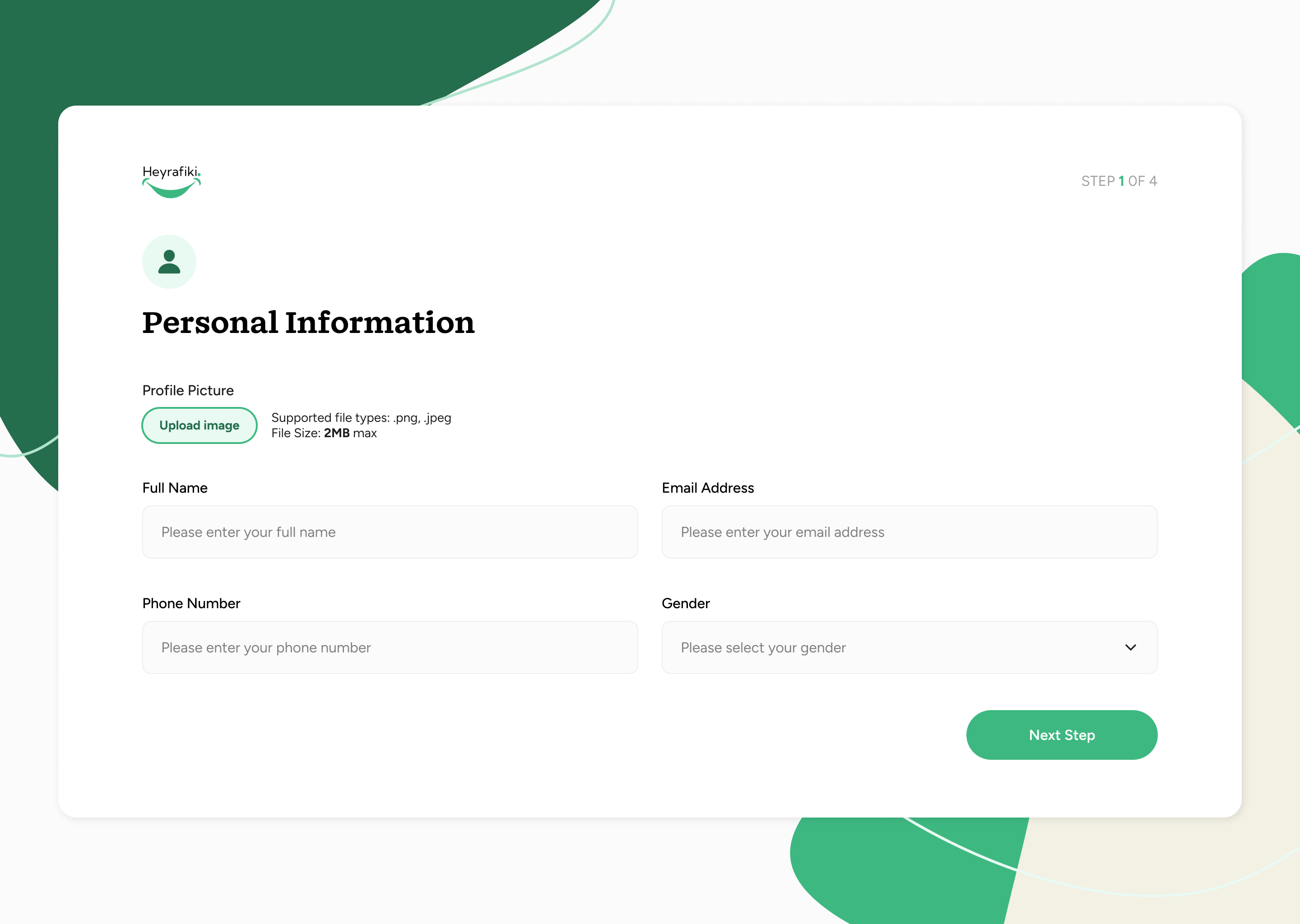
Onboarding & Intake Flow
The hardest screen to design: the first one.
Onboarding for a mental health product is categorically different from onboarding for a productivity app. The user arriving at HeyRafiki for the first time may be in distress, may have never spoken to a therapist, and may be anxious about being judged. That shaped every decision in the intake flow.
01
Welcome
Warm, non-clinical entry
02
Goals
What brings you here?
03
Preferences
Therapist type, language, gender
04
Match
Curated therapist results
05
Book
Select time & confirm
Onboarding design decisions
- One question per screen: never overwhelming. Each step felt like a conversation, not a form. This reduced anxiety and increased completion rates.
- Language was deliberately gentle: "What brings you here?" not "Describe your mental health issues." The copy was written to meet users where they are, not where we needed them to be.
- Privacy reassurance at every step: small but persistent copy reminding users that their responses are confidential and never shared without consent.
- Skip options throughout: no question was mandatory. Users could move forward without answering anything they weren't comfortable with yet.
Therapist Matching
Match by fit, not just availability.
The matching experience was designed to help clients find a therapist they'd actually feel comfortable with, not just the first available slot. Filters for specialisation, gender, language, and session format gave users agency without overwhelming them with choice.
Matching design decisions
- Therapist profiles were designed like trust documents: qualifications, approach, specialisations, languages spoken, and a personal statement. Clients needed enough to feel safe before booking.
- Suggested matches surfaced first: based on intake answers, the system surfaced 3 recommended therapists before showing the full list. Reduces decision fatigue for anxious users.
- Session format clearly labelled: video, phone, or in-person. A user avoiding video for privacy reasons needed to filter this immediately without reading through every profile.
Client Portal
A calm, organised home for ongoing care.
Once matched, the client portal became the hub for their ongoing mental health journey: upcoming sessions, session history, notes, and easy rebooking. The design prioritised calm and clarity over feature density.
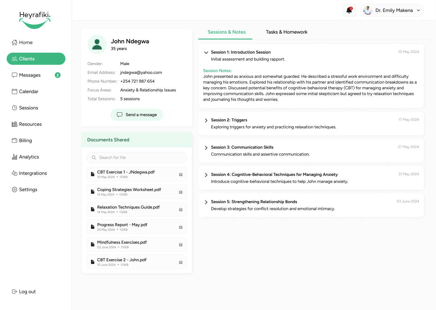
Therapist Portal
Less admin. More therapy.
The therapist portal was designed to eliminate the operational overhead that takes practitioners away from their actual work, managing a schedule across WhatsApp, chasing payments, and keeping manual session notes. Everything was centralised, clean, and built around a therapist's actual workflow.
Therapist portal design decisions
- Calendar-first layout: therapists live in their schedule. The dashboard led with an agenda view of upcoming sessions, not analytics or notifications.
- Client intake visible before each session: therapists could review a client's goals and history 10 minutes before the session starts without digging through records.
- Session notes built in: a lightweight notes field attached to each session kept records in one place, reducing the need for external documents.
- Payment dashboard: clear visibility of earnings, pending payouts, and session history. No more manually tracking who's paid.