Overview
Kenya's students deserved better than textbooks they couldn't afford and content that didn't engage.
EasyElimu is a Kenyan edTech platform providing digital learning content aligned to the CBC (Competency Based Curriculum) students — notes, revision papers, video lessons, and interactive quizzes, all in one place. For students in schools without adequate resources, it's often their primary study tool.
I was brought in to lead a full UX overhaul across both web and mobile, rethinking how students discover content, navigate their subjects, and engage with learning material in a way that actually holds their attention and supports how they study.
How do you design a learning platform that keeps a Kenyan student engaged enough to choose it over scrolling social media on the same phone?
The Challenge
The content was good. The experience was losing students before they got to it.
The existing platform had strong content; years of curated notes, past papers, and revision material. But the UX was getting in the way. Students were landing, getting confused or bored, and leaving before engaging with the material that could actually help them.
Before
- No clear content hierarchy; everything felt equally important
- Navigation required too many taps to reach study material
- No progress tracking: students couldn't see what they'd covered
- Mobile experience felt like a shrunk desktop site
- Generic UI: felt like any other website, not a learning tool
After
- Subject-first homepage: students land on what they need
- 3-tap maximum to any piece of content
- Progress bars and completion states per topic
- Rebuilt mobile-first with touch-optimised components
- Warm, approachable visual language that felt made for students
Design Process
Redesigning the student learning journey
The core journey a student takes, from landing on the platform to completing a study session, was mapped and redesigned at every step. The goal was to reduce friction at the top of the funnel and increase engagement once students were inside a subject.
01
Land
Subject selection homepage
02
Select
Grade & subject
03
Browse
Topics & content types
04
Study
Notes, videos, quizzes
05
Review
Progress & revision
Key Design Decisions
Designing for how students actually study
Homepage — subject-first, not feature-first
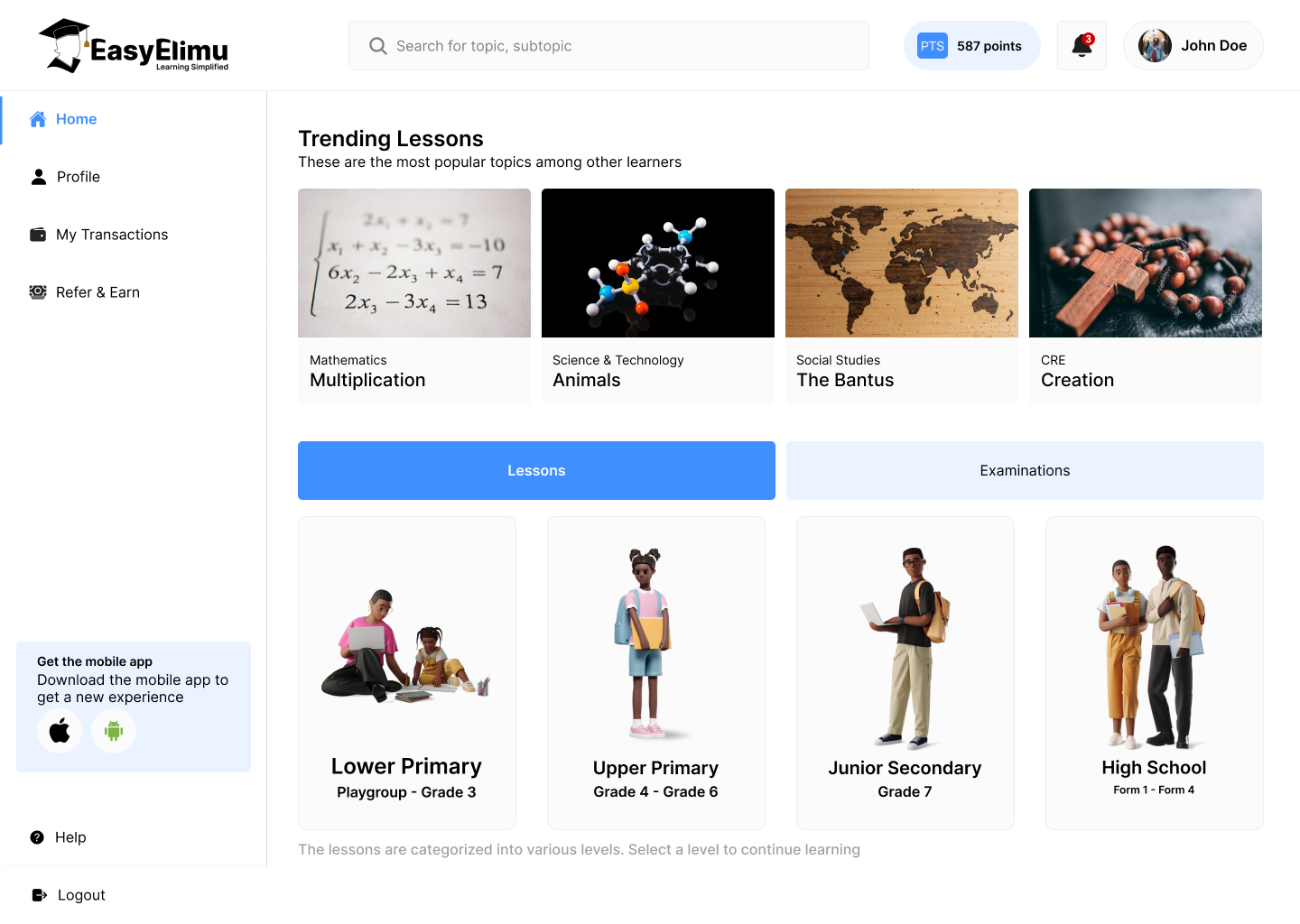
- Subject grid as the primary homepage UI: students land and immediately see their subjects with recognisable icons. No banner, no promotions, no confusion. The first tap takes you straight into learning.
- "Continue where you left off" persistent widget for returning students: reducing the time-to-study for users who already know what they're working on.
- Grade selector upfront: CBC spans multiple grades with different content. Getting grade context early prevents students from landing on wrong-level material.
Content experience — notes, papers, quizzes
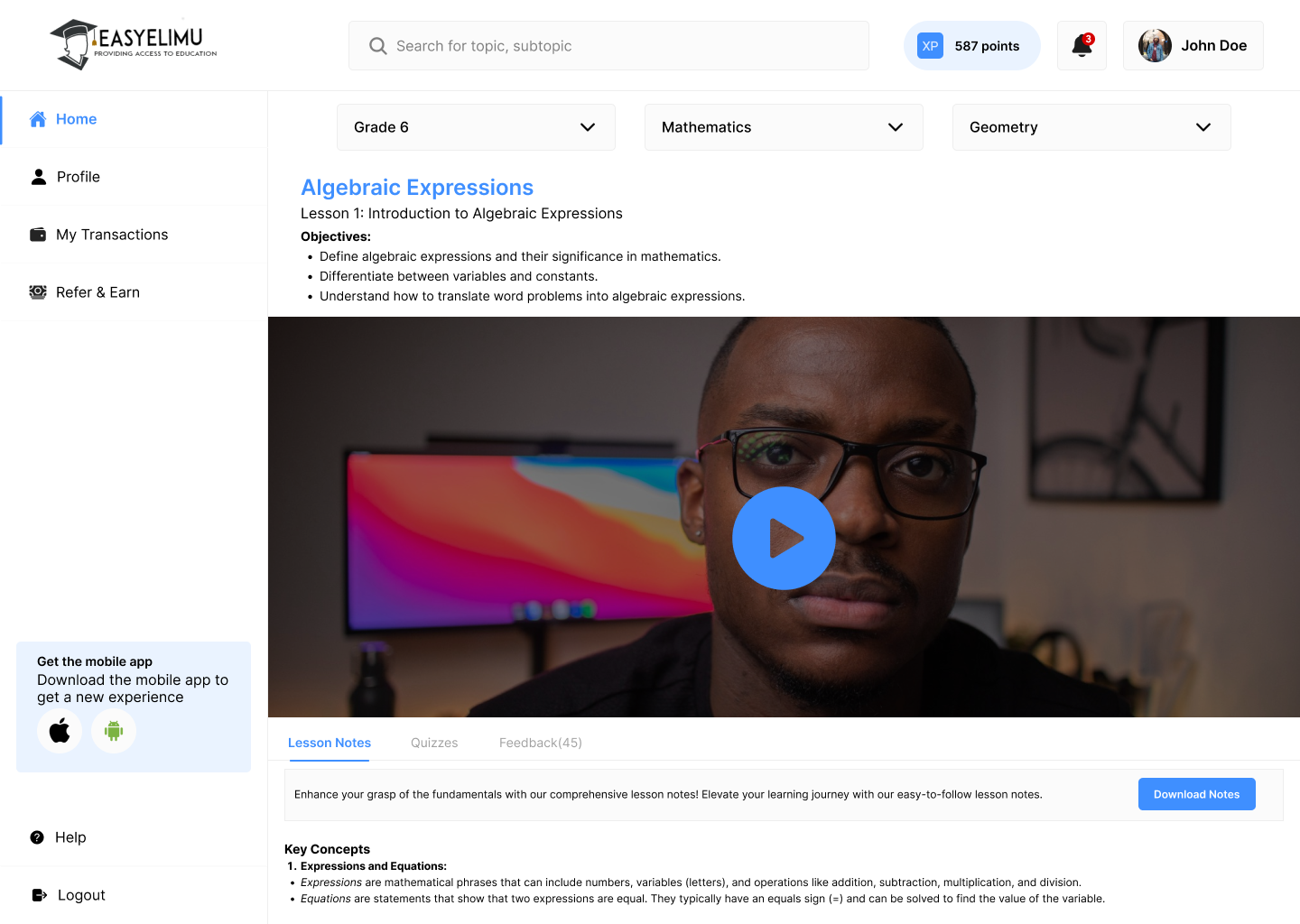
- Content type tabs within each topic: Notes / Past Papers / Quizzes. Students can switch content type without navigating back, keeping them in their study flow.
- Readable typography at every screen size: notes content on mobile needed a comfortable reading experience. Line height, font size, and paragraph spacing were all optimised for sustained reading on a small screen.
- Offline-downloadable PDFs: many students study in areas with limited data. Download indicators and offline badges let students know which content they can access anywhere.
Progress & motivation
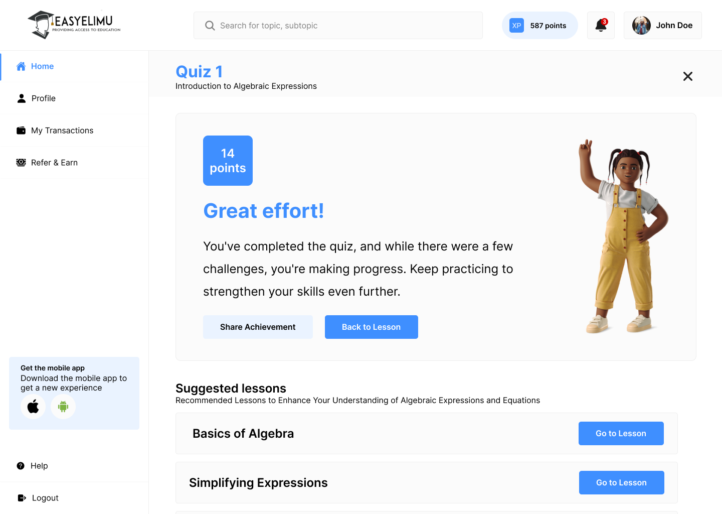
- Topic completion tracking: progress bars per topic let students see how much of a subject they've covered, creating a satisfying sense of momentum.
- Quiz results with explanations: wrong answers show the correct answer and a brief explanation immediately, turning quiz results into a learning moment rather than just a score.
- Revision reminders: opt-in nudges before exam periods, personalised to the subjects the student has been studying most.